S-Curves and Sats: Decoding the Future of Bitcoin Treasury Growth

Lately, I’ve been laser-focused on one thing: understanding the future growth of Bitcoin Treasury Companies (BTC-TCs).
My initial piece — The Half-Life of Bitcoin Treasury Companies — received plenty of ‘constructive’ feedback. But, ironically, since then, we've seen significant mNAV compression, with many BTC-TCs pulling back by over 50%.
Stacking gets harder when prices fall. ATMs become less accretive, and investor confidence erodes. Ultimately, not every BTC-TC wins. Only the strong (and smart) will survive because they can continue growing their BTC stack even through the hard times.
That’s why I believe modelling the shape of a company’s BTC accumulation curve is critical. It helps us determine whether a company is losing momentum or just getting started — and what that might mean for its future price action.
It’s not just for investors. BTC-TCs themselves can use this framework to manage growth more intelligently, stack more effectively, and navigate volatility with foresight.
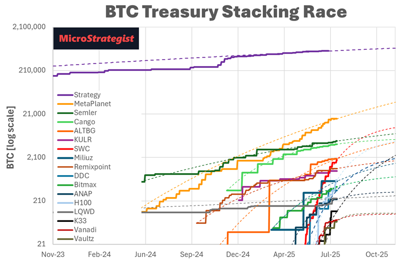
Recapping the Stacking Story: S-Curves and Reality
Here’s a look at actual BTC stacking data with the generalised Gompertz regression (a more gentle model than the more aggressive logistic regression).
Let’s double-click on The Smarter Web Company: Their stacking follows a predictable growth pattern, with regular buy announcements, so investors can understand how the strategy is unfolding. The regression shows an R² of 0.986 — extremely high correlation.
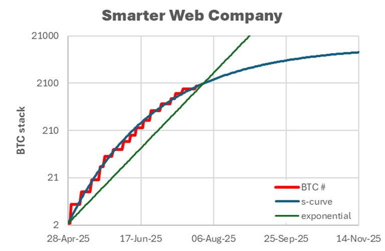
Some might see the log-scale chart as bearish. But on a linear scale, the trend is more reassuring.
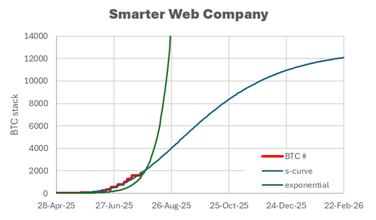
It’s tempting to project continued exponential growth, but with just 21 million BTC to go around, all stacking curves must slow eventually.
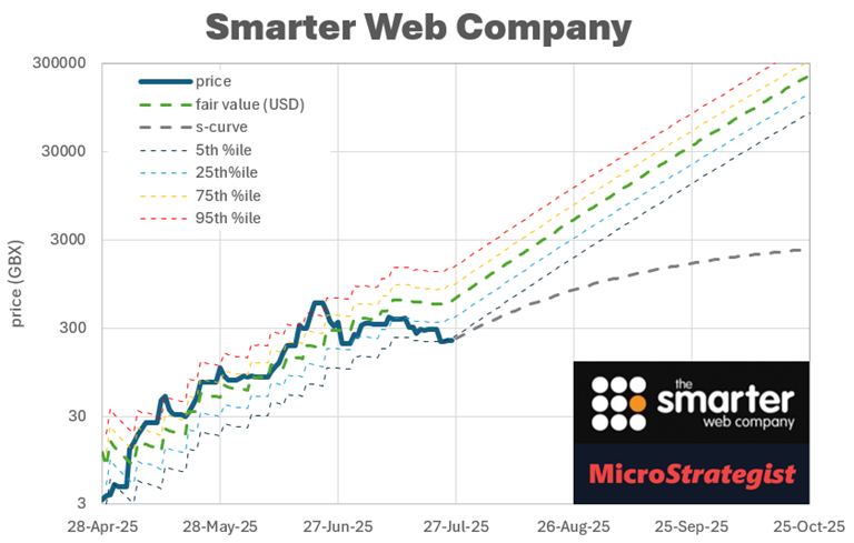
For SWC, our regression suggests an ultimate stack of ~12,800 BTC by late 2026 — a projection that we’ll refine as new data becomes available. A few recent solid BTC buys and a significant pullback in price now makes SWC look very attractive!
Forecasting Price Scenarios
These models don’t just help us understand stacking — they allow us to simulate bearish scenarios for each BTC-TC. The grey dotted line on the charts represents conservative price forecasts based on the stacking trajectory, while the more bullish fair value model is based on their current BTC Yield.
Using this approach, we can then rank BTC-TCs based on their near-term upside or downside potential.